Sample of Patterns: Comprehensive Guide to Pattern Designs
Once you start noticing patterns, you’ll see them everywhere—in nature, fabrics, web backgrounds, even famous artworks. Patterns are just repeating shapes, lines, colors, or textures that bring order, movement, or a little decoration to a design.
A handy sample of patterns gives you real examples of different types—geometric, organic, regular, irregular—and shows how each works in actual projects like branding, textiles, or web layouts.
This article explores the kinds of patterns, why they matter, and how to pick and use them so your designs feel intentional and work well.
Understanding Patterns: Types, Uses, and Key Examples
Patterns repeat designs or sequences you can use to decorate, organize, or solve problems. You’ll learn what pattern images are, the main pattern types, practical uses for seamless pattern and pattern design, and where to find samples and pattern images online.
What Are Patterns and Pattern Images?
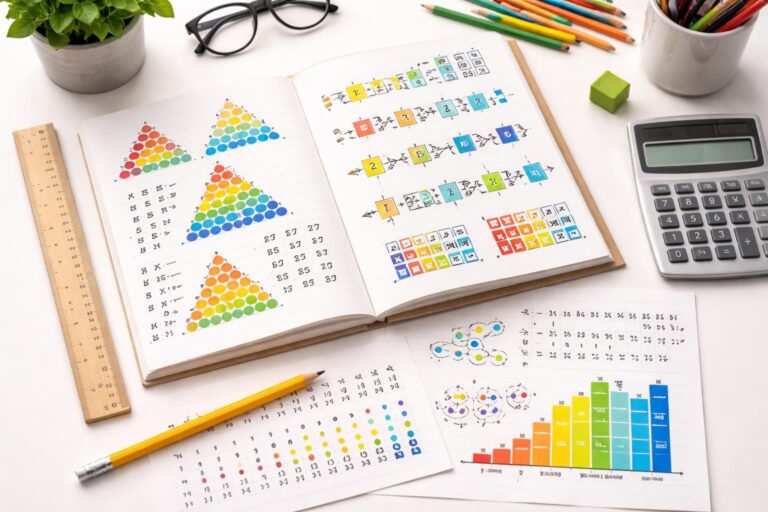
A pattern repeats shapes, colors, or numbers in a way you can copy. In visual design, a pattern image shows a motif—maybe leaves, dots, or geometric shapes—repeated in a grid or tile so it looks continuous.
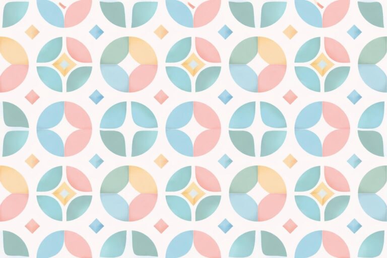
Seamless patterns tile without visible edges, so when you use them on fabric, wallpaper, or a webpage, everything looks connected. You can export pattern images as PNG, JPG, or vector (SVG, AI), depending on what you need.
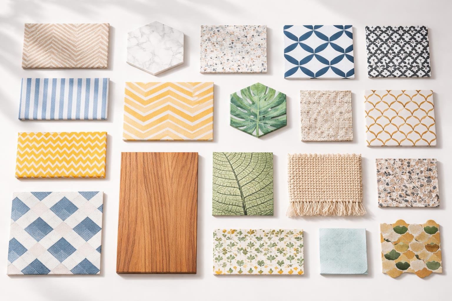
When you look at a pattern image, check out the motif, repeat type (straight, half-drop, mirror), color palette, and scale. These details help you match the pattern to projects like textiles, packaging, or backgrounds.
Popular Types of Patterns
You’ll run into a few common pattern families across art and design.
- Repeating/Seamless: Motifs tile with no seams, perfect for backgrounds and fabrics.
- Geometric: Circles, stripes, and grids create a modern, clean look.
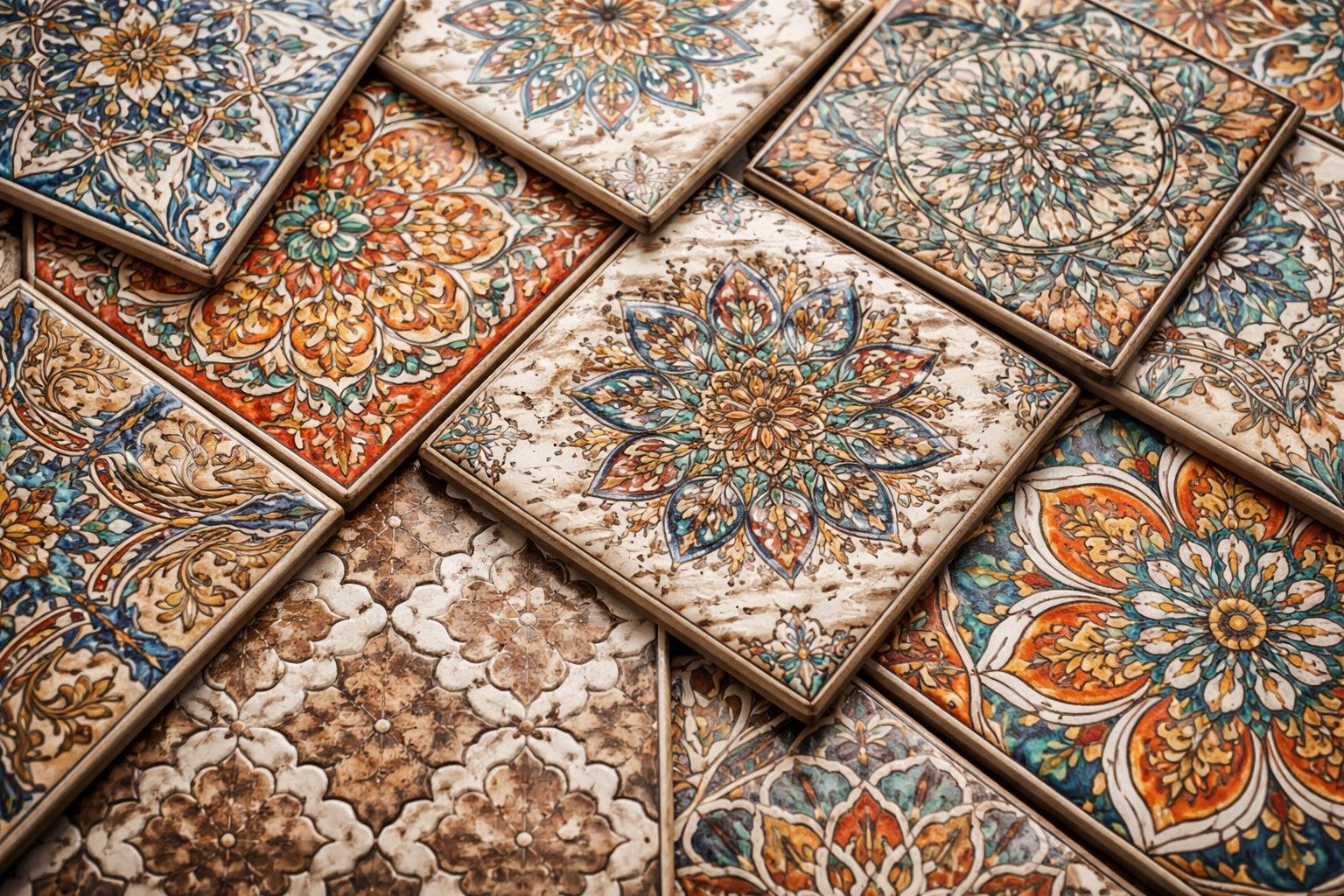
- Floral/Natural: Leaves, flowers, and organic forms show up in textiles and stationery.
- Abstract/Texture: Nonrepresentational marks or brush strokes add depth.
- Motif-based: Distinct icons or scenes repeat, often for branding or themed products.
You can tweak each type by scale, color, and spacing to keep things fresh. Designers often mix types—like geometric grids with floral motifs—to create something new.
Common Uses of Seamless Patterns and Pattern Designs
People use seamless patterns in lots of real projects where repetition needs to look natural.
- Textiles: Apparel, curtains, and upholstery rely on repeatable pattern designs for production.
- Surface print: Stationery, wrapping paper, and book covers use pattern images to add interest.
- Web and UI: Backgrounds and hero sections use subtle seamless textures so users don’t get distracted.
- Branding and packaging: Patterns help reinforce brand identity on boxes, bags, and labels.
- 3D and product mockups: Designers apply patterns to models to preview how things might look.
When you pick a pattern, think about repeat size and file format. Large repeats need high-res or vector files. You’ll find ready-made pattern samples on marketplaces like Freepik in raster and vector formats.
Key Platforms for Sample of Patterns
You’ll want to know where to get pattern images and design assets quickly.
- Freepik: Tons of free and premium pattern images, vectors, and seamless tiles. Great for quick mockups.
- Marketplaces (Creative Market, Envato): Curated pattern packs and editable files for commercial use.
- Stock sites (Shutterstock, Adobe Stock): High-quality pattern designs and matched color variations.
- Design tools (Figma, Canva): Built-in pattern libraries and easy tiling controls for web and UI projects.
- Open sources and community sites: Sites like Pixabay and public domain libraries offer free pattern images for noncommercial use.
Watch the licensing. Freepik and stock sites might ask for attribution or a license for commercial work. Download vector files (AI, SVG) if you need to resize things without losing quality.
How to Choose and Use Pattern Designs Effectively
Pick patterns that fit your purpose, colors, and the size of your item. Think about scale, contrast, and how the pattern will actually sit on the surface.
Selecting the Right Pattern Designs for Your Project
Choose a pattern based on where it’ll show up and how people will use it. For clothing or fabric, print a 6–12 inch swatch to see the repeat and motif size in real life.
For big surfaces like wallpaper, go for medium-to-large repeats so the design reads from across the room.
Match pattern color to your main palette: one dominant color, one accent, and one neutral. That keeps things balanced and easy to pair with other items.
Think about texture and production limits. If you’re printing on fabric, check dye and weave constraints. For screens, confirm resolution and repeat tile size so seams don’t show.
Tips for Background Design and Phone Wallpaper
Keep phone wallpaper simple so your icons stay easy to read. Try low-contrast motifs or blur the pattern to avoid clutter behind app names.
For desktop or large background designs, keep focal points away from UI elements. Put busy parts where they won’t overlap important text or controls.
Use a tiled pattern with a seamless repeat for backgrounds that need to scale. Test at common screen sizes (like 360×800, 1080×1920, 1440×2560) to make sure the design crops well.
Save web or phone wallpaper files as optimized PNG or JPEG with the right color profile to keep lines crisp and file sizes small.
Incorporating Lines and Geometric Elements
Try using lines to guide the eye and make the design feel alive. Vertical lines can add a sense of height, while horizontal ones feel calm. Diagonal lines? They always seem to bring some energy.
If you mix up line weights—like thin and thick lines—you’ll get a natural sense of hierarchy. It just feels right.
When you play with geometric patterns, think about the scale and how close things are together. Small, dense grids almost turn into a texture, but big geometric shapes? They really grab attention.
Choose your grid type based on what you want to say. Squares feel organized, triangles add some excitement, and hexagons have this strangely organic vibe.
If you’re putting lines on backgrounds or wallpapers, always check the contrast. Thin lines can disappear on certain screens, which is honestly pretty annoying.
Keep your alignment consistent so patterns tile smoothly. Uneven margins can mess up the whole flow, so watch out for that.