
Mathematical Patterns and Designs: Unlocking Beauty in Numbers and Art
You notice patterns everywhere—shells, city grids, logos, even the way tiles line up in your bathroom. These patterns stick to simple rules you can actually use in your own work.
Mathematical patterns like the Fibonacci sequence, the golden ratio, and symmetry give you straightforward, repeatable tools to create balance, flow, and visual interest in design.

This post breaks down the basics so you can see how patterns form and where they shine. You’ll spot real examples of iconic patterns and pick up practical ways to bring them into layouts, logos, and compositions—helping your designs feel ordered but still natural.
Fundamentals of Mathematical Patterns

Mathematical patterns reveal how numbers, shapes, and symbols repeat or change by following clear rules. You’ll learn what a pattern is, the main types you’ll run into, and how to spot them in both problems and design.
Defining Mathematical Patterns
A mathematical pattern is just a sequence or arrangement that follows a rule you can describe. It might be a row of numbers, a line of letters, or a set of shapes that repeat or evolve.
For instance, the arithmetic sequence 2, 5, 8, 11 adds 3 each time—that’s the pattern’s rule. Sometimes you can write a formula for the pattern, and sometimes you just figure out the rule by looking at examples.
You use patterns to predict the next items or check your work. In design, a repeating shape or a spiral that grows larger follows the same basic idea: there’s a rule guiding where things go and how big they get.
Types of Patterns in Mathematics
You’ll run into a few common pattern types. Number patterns include arithmetic sequences (where you add a constant) and geometric sequences (where you multiply by a constant).
For example:
- Arithmetic: 4, 7, 10, 13 (add 3)
- Geometric: 3, 6, 12, 24 (multiply by 2)
Other patterns show up too—like repeating patterns (ABAB or AABB), letter patterns (think of coding rhythms), and shape patterns (tiling, symmetry, those fractal-like repeats). The Fibonacci sequence mixes arithmetic ideas into design; each term is the sum of the two before it.
If you spot the type, you can pick the right rule or formula to solve or create your own pattern.
Recognizing Patterns and Pattern Recognition
You get better at recognizing patterns by hunting for the rule that links each part. Try checking the differences for arithmetic patterns and ratios for geometric ones.
For repeating patterns, mark out one cycle and see how often it comes back. In shape patterns, look for moves like sliding, turning, flipping, or resizing.
Use quick tests: subtract numbers in order, divide terms, or see how one shape transforms into the next. Write the rule in plain words and numbers. Practice with all sorts of examples—numbers, letters, and shapes—to sharpen your eye.
Pattern recognition helps you predict what comes next, prove results, or design layouts that just feel right.
Iconic Mathematical Patterns and Their Designs
Let’s see how certain patterns shape design choices—number sequences that set proportions, ratios that guide layouts, repeating shapes that tile a surface, and self-similar forms you’ll spot in both nature and art.
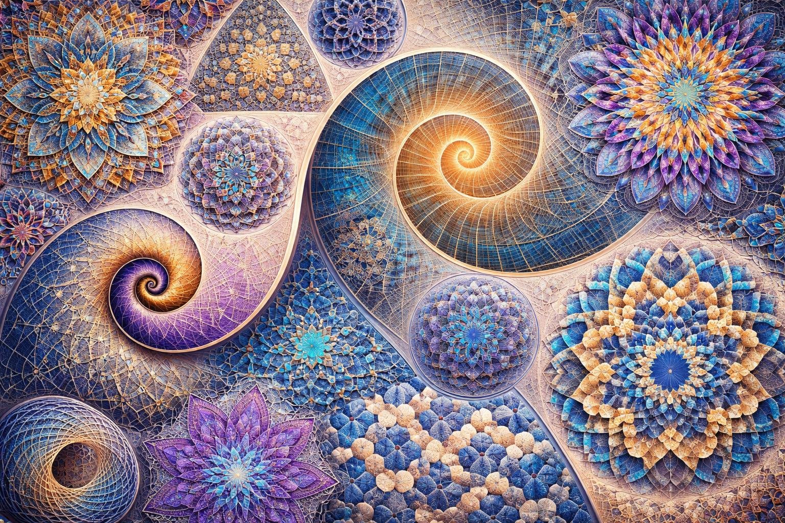
Fibonacci Sequence and Applications
The Fibonacci sequence goes 0, 1, 1, 2, 3, 5, 8, 13… Each number is just the sum of the two before it. You can map these numbers onto squares or circles to build spirals and branching layouts.
Web and print designers use Fibonacci numbers to set spacing, grid units, or element sizes. For instance, a row of boxes sized 5, 8, 13 creates a nice visual flow across a page.
Sunflower seeds and pinecone scales actually follow spirals based on Fibonacci numbers. You can echo these patterns to make your work feel organized but not stiff.
Some practical tips:
- Try Fibonacci steps for modular scale—think font sizes or spacing.
- Pair a Fibonacci-based grid with simple alignment for balance.
- Play with ratios on real layouts; even small tweaks can shift the whole vibe.
The Golden Ratio: 1.618 and Phi
The golden ratio (phi ≈ 1.618) links closely to Fibonacci numbers—ratios of consecutive Fibonacci numbers get closer to phi as you go. Use phi to size images, place focal points, or build rectangles that just look “right.”
Artists like Leonardo da Vinci built compositions around the golden ratio. In UI work, you might set a column to 61.8% width and a sidebar to 38.2% for a subtle sense of balance.
The ratio sneaks into product and logo design too, guiding curves and spacing. But don’t treat phi as a strict rule—sometimes it helps, sometimes it’s just a number.
Quick ideas:
- Crop images into golden rectangles.
- Use phi-based margins for balanced white space.
- Try ratios in icon grids to keep visual weight steady.
Fractals and Self-Similarity
Fractals repeat the same shape at different sizes. Each part looks a bit like the whole thing—that’s self-similarity.
You’ll notice fractals in nature: tree branches, river networks, leaf veins. In design, fractal ideas add texture and a sort of organic rhythm.
Procedural backgrounds or branching info maps borrow from this concept. Fractals even connect to chaos theory—simple rules can make surprisingly complex, repeatable patterns.
How to use them?
- Build layered patterns that repeat at smaller scales.
- Keep the structure simple; the magic comes from repeating, not overcomplicating.
- Watch visual density so fractal textures don’t drown out your content.
Tessellations and Geometric Patterns
Tessellations fill a plane with repeated shapes—no gaps, no overlaps. Geometric patterns pop up as regular polygons, star motifs, or interlocking grids.
You might see these in wallpapers, textiles, icons, or even brand patterns. Artists like Salvador Dalí, along with old-school craftsmen, played with polyhedra and tessellated motifs to create bold visual effects.
Today, designers use tessellations to add rhythm and give surfaces a unique identity. They also help with alignment and modular systems, which is honestly pretty handy.
Try building variants with symmetry, rotation, or translation. Just watch the contrast and scale so the repeating motifs don’t mess with readability.
Design checklist:
- Pick a base tile—maybe a square, triangle, or hexagon—and repeat it with some transformations.
- Test the repeat at different scales to make sure it’s still easy to read.
- Pair your geometric patterns with clear typography, so everything stays balanced.