
Different Types of Patterns: Essential Styles and Fabric Examples
Patterns influence how you spot, choose, and use designs in clothes, homes, and art. Let’s get into what the main pattern types look like, how they act, and where they really shine—so you can pick the right style without second-guessing.

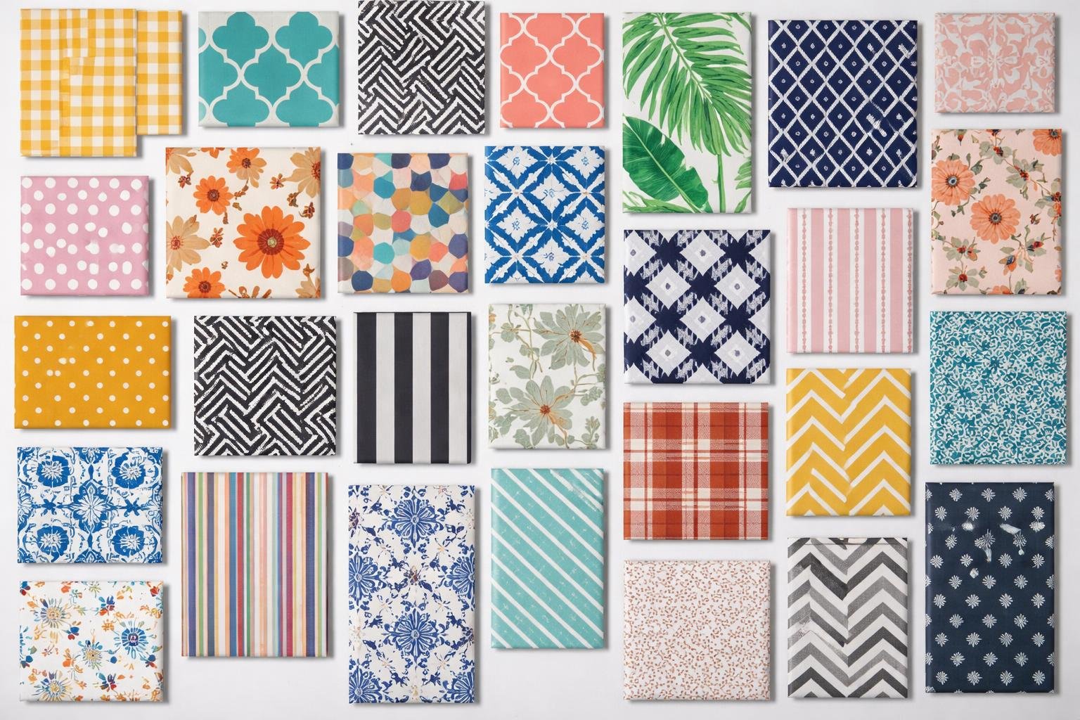
You can recognize and use geometric, organic, textured, and cultural pattern groups to match mood, scale, and function in any project.
I’ve broken these ideas into sections that highlight key traits and showcase artistic styles. That way, you can spot differences and use patterns with a bit more purpose.
Key Types of Patterns and Their Characteristics
You’ll see these pattern families everywhere—in clothing, home textiles, and graphic design. I’ll explain how each pattern works, where it fits best, and which versions to pick depending on your project.
Stripes and Stripe Patterns
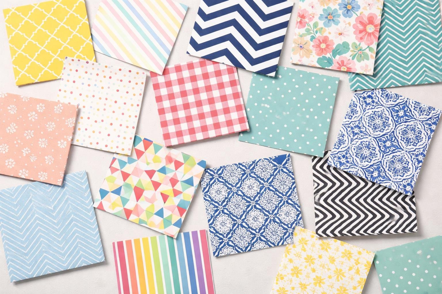
Stripes run as parallel lines across fabric or surfaces. There are a bunch of forms: vertical stripes (slim lines that lengthen the body), pinstripe (very thin, classic for suits), candy stripes (bold, evenly spaced), and awning stripes (wide, high-contrast bands you’ll spot outdoors).
Use vertical stripes to give something a taller look. Horizontal or wide stripes feel casual. Pinstripes give off a sharp, business vibe. Candy and awning stripes bring boldness and a relaxed mood.
Stripe spacing and contrast change the effect. Narrow, low-contrast stripes look subtle from a distance. High-contrast, wide stripes feel loud and graphic. Think about scale: small stripes are good for shirts and ties; big stripes suit curtains, rugs, and umbrellas.
Check and Checkered Patterns
Check patterns repeat squares or rectangles in a tidy grid. You’ll see checkered (high-contrast squares like a chessboard), checked patterns with smaller squares, and gingham (even-sized checks in two colors).
Checks suit casual shirts, tablecloths, and upholstery. Buffalo check uses big two-color squares and feels rustic. Windowpane has thin grid lines with big open squares—think suits and blazers.
Scale and edge crispness matter here. Small checks feel busy; big checks pop. Crisp edges look modern, while washed edges seem vintage or easygoing. Match the check size to the item so the pattern doesn’t take over.
Plaids and Tartan
Plaid and tartan mix intersecting horizontal and vertical bands of color. Tartan carries history and specific color orders. Plaid is a broader term for woven multi-color checks.
People use tartan for kilts, scarves, and heritage pieces. Plaid comes in layered small checks or bold bands. Glen plaid and windowpane plaid work well in suits, blending fine checks with overlaying stripes.
Color repeats and line thickness set the mood. Thin crossing lines add subtle texture. Wide bands bring bold, classic looks. Plaids move easily from wool coats to cotton shirts—match fabric and weave to the job for best results.
Polka Dot and Dot Patterns
Polka dots are spaced, round dots on a contrasting background. Dot size changes the vibe: tiny dots feel delicate and retro, medium dots are playful, and big dots get graphic and modern.
You’ll see polka dots on dresses, blouses, swimwear, and bedding. Some versions have irregular dots, clusters, or low-contrast tones. Black-on-white dots look classic; colored dots on neutrals feel more relaxed.
Pattern repeat and alignment matter. Regular dot grids look clean and rhythmic. Scattered or ditsy dots soften things up. Adjust dot size and contrast to fit the occasion and the item.
Distinctive and Artistic Pattern Styles
You’ll spot patterns built on precise shapes, ones inspired by nature, and some wild animal designs. Each style changes texture, mood, and how you use it in clothes, interiors, or graphics.
Geometric and Abstract Patterns
Geometric patterns rely on clear shapes—squares, triangles, hexagons—to create order. Look for chevron, herringbone, harlequin, argyle, quatrefoil, and honeycomb. These show up in tile, wallpaper, and modern fabrics because they repeat and lead the eye. Greek key and trellis patterns add a classical, structured vibe. Ogee and basketweave bring curves or woven effects that add texture from afar.
Abstract patterns skip literal shapes and focus on color, line, and rhythm. You’ll find them in digital prints, modern fabrics, and art prints. Abstracts often mix geometric bits with freeform marks for movement. Use them when you want energy without a set theme. They pair well with solids and textured patterns to calm down busy looks.
Floral and Botanical Patterns
Floral patterns go from tiny ditsy prints to big chintz and toile scenes. You’ll spot paisley, medallion shapes, and chinoiserie that bring history and culture. Ikat and batik methods blur the edges of botanical designs, while brocade, jacquard, and embroidery add raised texture and a bit of luxury.
Chintz and toile de Jouy usually tell stories with repeated scenes; ditsy prints keep things small and casual.
Use florals to add warmth or charm to upholstery, curtains, or dresses. Match the scale to the room or item: small motifs work in busy spaces or on clothes, while big botanicals become bold focal points. Fabric matters—jacquard and brocade show off pattern detail, while digital prints can handle complex colors on lighter fabrics.
Animal Print Patterns
Animal prints take inspiration from fur, skin, or camouflage, and they usually show up as bold statement accents. You’ll spot classic examples like leopard, cheetah, zebra, and even bird’s eye patterns.
Some prints, like camouflage or quirky animal motifs, look more graphic and modern. People use these prints on clothes, rugs, or accessories—anywhere that needs a bit of contrast or a punch of boldness.
Try animal prints if you want to add some edge or texture. Leopard and cheetah prints use spots to bring in warmth, while zebra stripes create real drama with their high contrast.
Keep the rest of your patterns simple, or things might start to clash. If you’re not into loud looks, go for small-scale or muted animal prints. But if you’re after something that really pops, pick large-scale or high-contrast patterns.